NOŪS Santorini
Noūs, this new resort just outside Messaria, Santorini, member of Design HotelsTM, combines the new and the old. It is renovating the pre-existing hotel unit (Santorini Image) and expanding it adjacently with new buildings, reaching a total capacity of 121 rooms. The prior layout of functions was revised in favor of a new overall design that placed landscape as the primary element: with a stepped configuration at the entrance, with a linear gradation from flower beds to oleanders at the spa area, with introverted private gardens at the bungalows, landscape creates different atmospheres at each area.
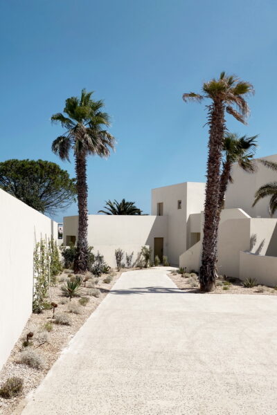
Instead of the preexisting reception which was close to the community road, with direct access from the side road within the plot, we decided to move it to a more central position, to create an entry ceremonial promenade that constitutes a transition and decompression from the hustle of the island to the calmness of Noūs. We designed this promenade with shaded areas, plantation and decorative water: One crosses three successive pergolas designed as aerial, suspended gardens with climbing plants – shaded sitting areas are formed at their ends. The design of each such tension-wire pergola -a reinterpretation of Athenian overhead trolley cables- retracts its supports (and thus the plant’s trunks) beyond the limits of peripheral vision. Escorting the entrance path, on either side of the stepped ramp, a water course rolls over stepped lava slabs – a reference to the island’s volcanic history.
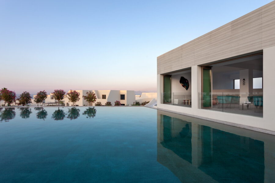
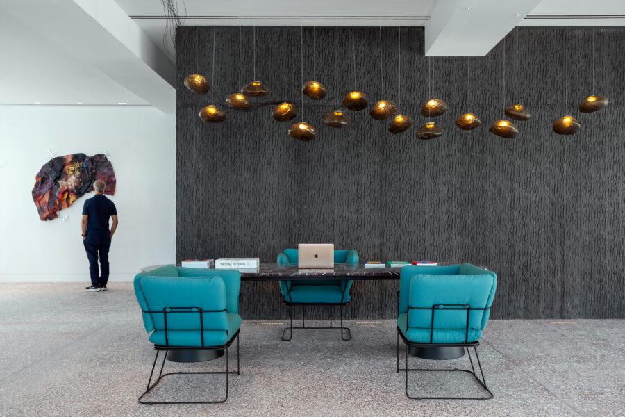
Arriving at the new reception, we are greeted behind the reception desk by a carved black wall. One could say in resemblance with the first image one has when approaching Santorini by boat: with the black rocks on the volcano and Nea Kameni. The reception opens up towards the central swimming pool, as the latter frames the view towards the sea and bends in the distance to the left -there, it forms a smooth, artificial beach towards the restaurant. Overhead, natural materials are selected: in the pool bar makuti covers the lower side of metal pergolas that take on organic shapes, while inside the restaurant the ceiling acquires illuminated wicker baskets. The presence of nature is also preserved in the bar on the upper floor in a large green wall as well as – on the terrace – in new metal pergolas that are frames for climbing frames. In the bar as well as in the central internal staircase leading to it, the extensive mosaic floors of the unit are combined with trapezoidal marbles, creating surfaces rich in color: the coexistence of these small and large-scale random materials simulate the fragmentation of materials in this volcanic island.
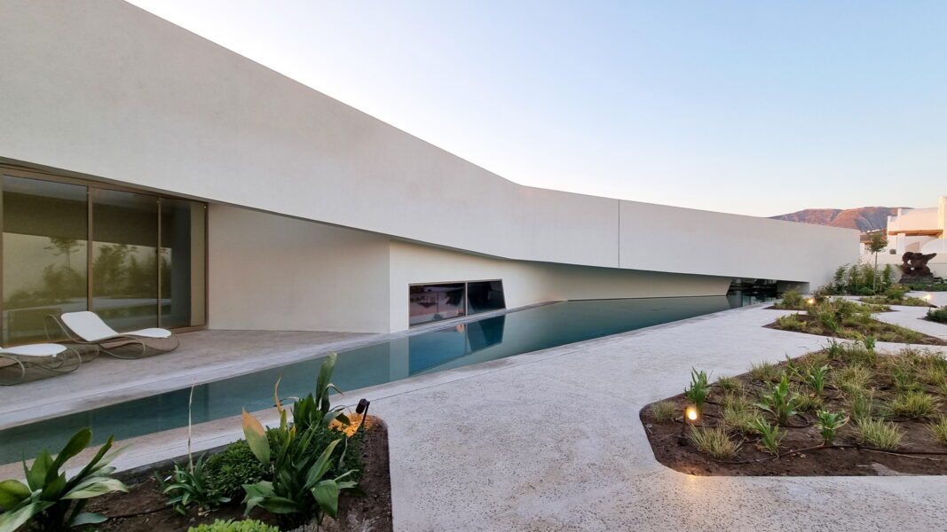
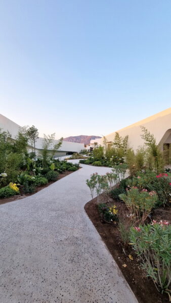
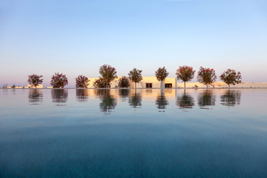
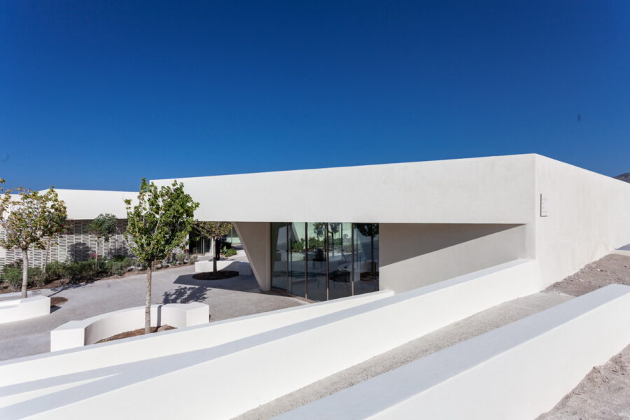
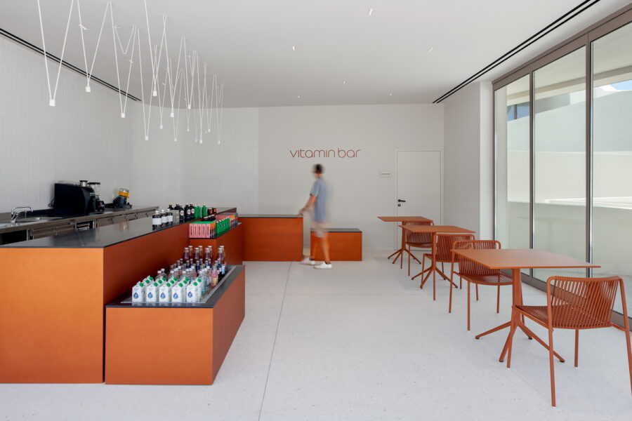
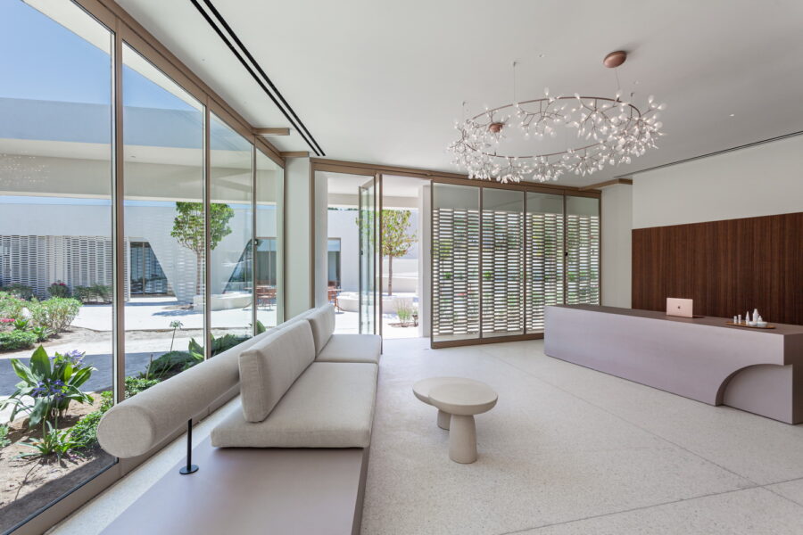
Lower on the property, the spa serves as a connecting element in the overall plot: placed centrally, it unfolds from the South part of the plot to the North part. Its inner sheltered courtyard of variegated planting is continued to the north by an expanse of oleanders below the central pool. In this way the carving of the landscape from the spa courtyard to the oleanders, unites new and old, the new suites with the renovation of the pre-existing Hotel, Santorini Image (1987-2010). The spa maintains a low profile so that escapes from neighboring suites remain unimpeded towards the East, towards the sea. The inner courtyard of the spa is suited to its function –instead of a large air-tight building, here you cross diagonally across the courtyard with its irregular planted areas: from the reception and changing rooms, across, to the gym, vitamin bar and treatment rooms. The west wing, due to the slope of the ground, is partially submerged in the ground. With this introverted typology, the spa simulates the natural ravines dug into the island’s volcanic pumice (called aspa), which characterize important settlements of the island such as Phoenikia and Vothonas (here the name itself means in Greek “large natural pit, ground subsidence”). It is this configuration of the natural terrain in the above settlements that leads to the construction of the characteristic cave dwellings on their sides. In the spa, white brick filters create porous boundaries and a play of light and shadow, a direct reference to one of the most successful architectural vocabularies of the modern reconstruction of Santorini after the 1956 earthquake, as it was then applied to the schools, banks and residences of the island.
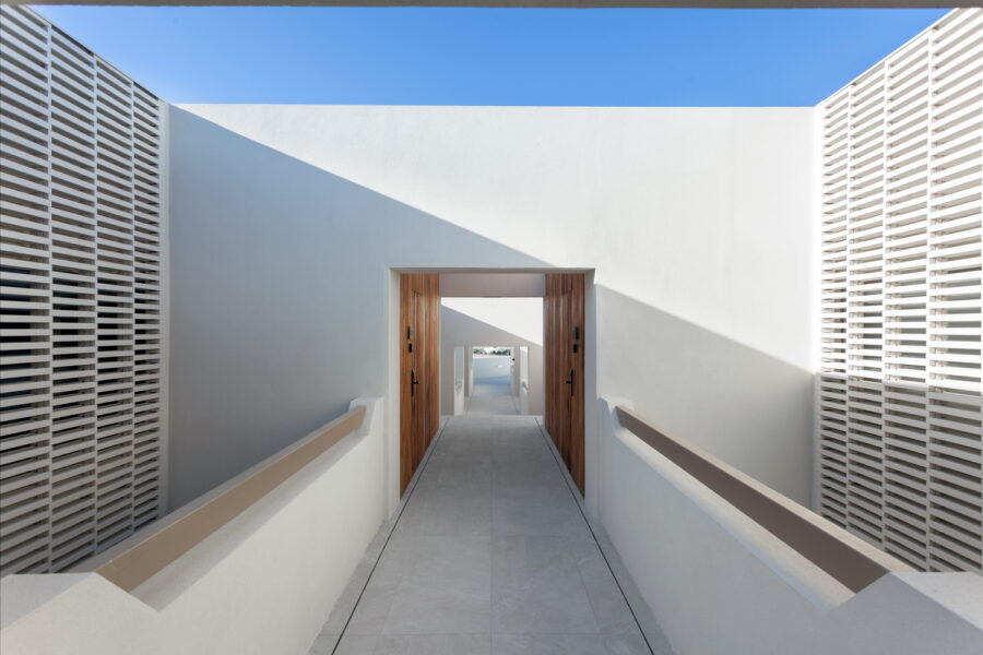
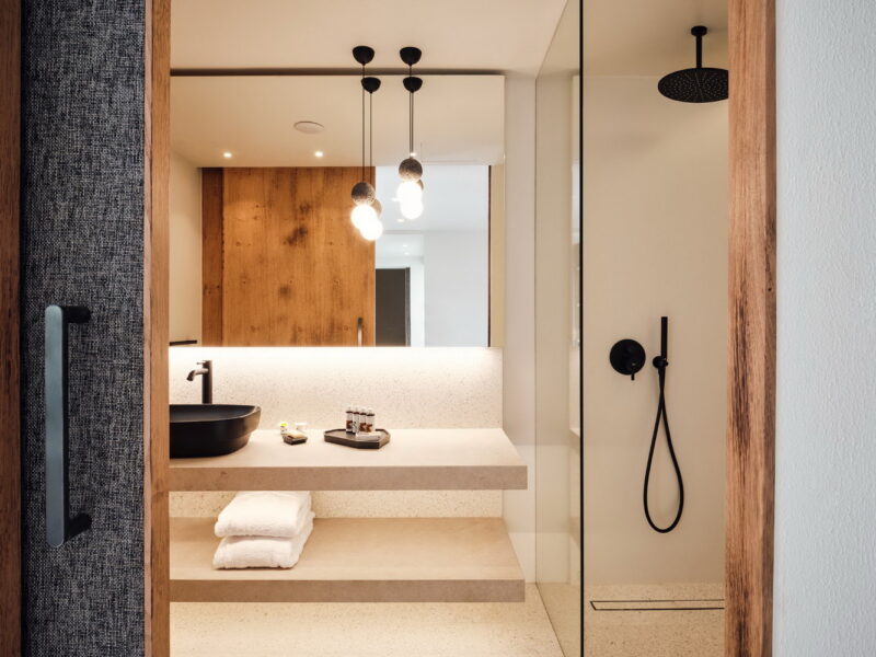
In the existing linear buildings of Noūs that flank the pool on the North and West sides, the renovation boldly replaced the central corridor with a completely new open-air route that offers a play of light and shade: In this way the arrival to the first floor rooms is made by a bridge which successively crosses seven courtyards with brick filters framing spacious bath rooms. In the creation of these rooms, the integration of conical recesses becomes a central theme, both in their new facades and in the interiors where, framed by tinted mirrors, they form modern “caves.” The rooms on the ground level have courtyards –makuti under the metal pergolas frames the fields around the unit and relates to them in texture and color.
The basic “icon” of Santorini’s architecture, the vault, was dominant in the pre-existing resort, Santorini Image, completed in 1987. And in fact, multiplied, it covered all buildings, regardless of proportions: From bungalows to the largest linear buildings, whether they housed rooms in a row or common areas. Realizing that the vault had ended up being scenography, we removed all vaults in our renovation, seeking alternative ways to connect to the island. In other words, it was understood from the beginning that the vaults “short-circuited” any attempt at architectural renovation. It was, after all, superfluous in terms of construction: Historically the vault had been extensively developed in Santorini in single-storey buildings due to the almost total lack of timber on the island –in combination with the strong mortars offered by aspa, it provided solutions that bridged openings without the use of wooden beams, also providing cooling (due to the height) in the hot climate of the island. Visible vaults were not used on the island for two-story buildings –all two-story buildings (as well as some single-story buildings) were built with vaults (or cross vaults) in the interior, hidden behind a flat roof. The reinstatement during the extensive reconstruction of the island of the two-story concrete visible vaults on the roofs no longer followed a constructional necessity but attempted a fictitious, falsified connection with traditional architecture.
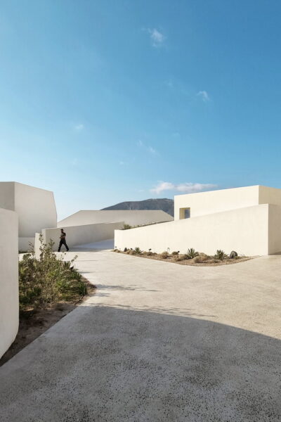
We attempted a corresponding revision in the organization of the landscape in the bungalow section. This was resolved in 1987 as if in a campus, where radial paths connected the buildings, like autonomous wings of a university. Among them a planting of conifers, lavender and shrubs which, like the extensive lawns around the old pool, were not associated with Santorini. Our research around the formation of this gently sloping landscape resulted in the formation of clusters/neighborhoods protected by curved walls: The movement between the bungalows is characterized by these soft curved walls that ascend and descend gradually. These fluid, organic contours continue the spa design and create enclosed private gardens instead of the prior “open” landscape.
In the linear buildings that overlook the
common pool, brick filters flank the
open-air central corridor that
leads to the hotel rooms.
We were inspired for this organic design by driving to Vlychada beach in Santorini: the car gradually descends towards the sea in an arid landscape where sand dunes of aspa form a road with continuous, gentle curves. A barren landscape with dry grasses and vines unfolds before you, a desert aesthetic. Many other beaches on the back side of the island have the same materiality, such as Baxedes further north, while the well-known stone terraces on the planted eastern slopes of the island preserve curved outlines. This arid relief landscape can also be found in Spain, in Bardenas Reales, in Navarre. Another important reference is Andreas Gursky’s two photos, Bahrain I and Bahrain II which are digital edits from the (equally deserted) Bahrain Formula 1 circuit (the edit adds additional laps to the existing track design). And without a doubt there are influences in the curved lines, especially in the spa from Zaha Hadid or from Enric Miralles – architects we looked at carefully, since their work refreshingly attempts this osmosis of landscape and building.
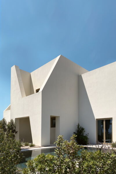
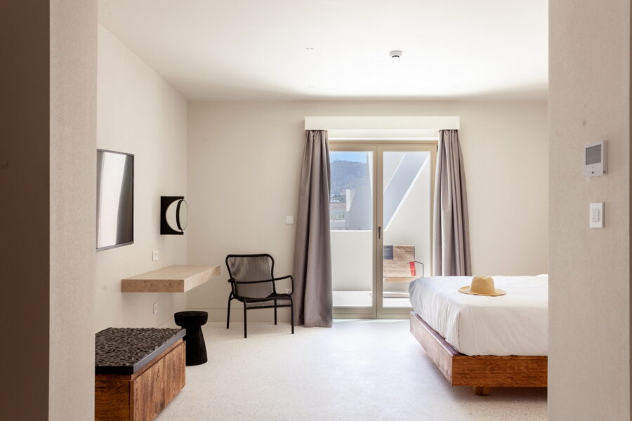
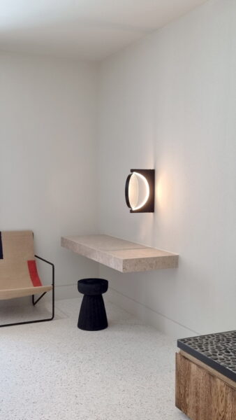
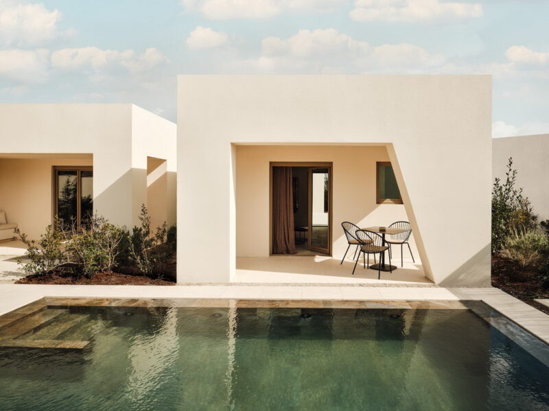
Looking for novelty, having removed the vaults in the bungalows, we shaped their facades with free walls that end in slanted sections, defining balconies on the first floor and semi-open spaces on the ground floor. This shaping of the facades gives variety to the whole, attempts a built simulation of the shadows falling from volume to volume and abstractly transforms the land drops in the steep Caldera that faces the volcano. This vocabulary on the walls is also shared with the new suites located east and west of the spa: in these rooms their walls extend towards the view and unfold intricately demarcating courtyards and pools. From above one can see the terraced contours of their roofs aligned towards the sea and the linear gardens that mediate offering privacy. In the rooms, we chose new mosaic surfaces, wood paneling with surface burnishing, lights made from volcanic rock and dividers with fabric linings, materials that make up a rich palette with references to earthy hues as they unfold in a kind of geological section during the island tour.
Towards a Cycladic Modernism:
Noūs Santorini and the Mediterranean Wabi-Sabi
Τhe solid unwrapping facade of the spa in Noūs Santorini does not result from any rational procedure. It conveys the random and sculptural character of vernacular architecture in the Greek Islands, pointing towards a Cycladic Modernism. The lessons of traditional monolithic architecture with small windows are assimilated and reassembled here, after visiting Oia in Santorini systematically for 47 years. Our vernacular house there has a whitewashed double height facade split in two zones, both whitewashed: While the lower part is marked with two small windows and a (extra low) door, the upper part remains solid, a retaining wall for all the soil (aspa, the pumice of volcanic origin which constitutes all the upper soil layer in Santorini) that forms the roof. The two zones are almost aligned -the upper recedes only half a meter in relation to the lower zone. The resulting house was subterranean and the ground overhead, by virtue of being painted, had become architecture, a “silent” facade just as significant as the lower “conventional” facade. Primary facade and secondary retaining wall perform distinct roles: the primary, lower elevation seems calm and rectilinear although it hides the vault that forms exclusively the interior of the house. The upper wall may accommodate the chimney (in some kind of sculptural twist) and at the same time lowers gradually, with a graceful curve, following the steep downhill inclination of Kaldera. This dialogue of primary and secondary, wall and ground, dominant solid and fortress-like openings, had opened up for us new possibilities: One could juxtapose large expanses of inarticulate solid walls in contrast to porous parts that dealt with everyday life -entrance, movement, exit, ventilation and light. This house had proven that architecture could, even at this domestic scale, retain a sculptural part, one unobstructed by windows, thus without scale. The house built without architects1 in Oia had managed to reach architectural luxury, the beauty of being blank, to have nothing to do, to mask all necessity.
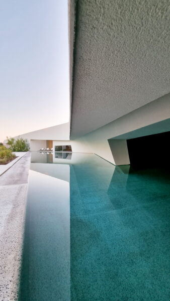
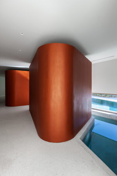
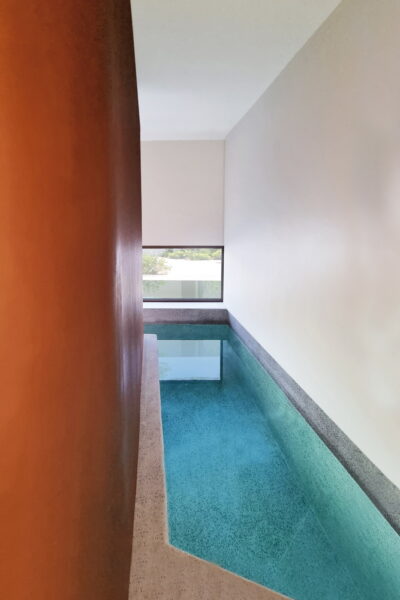
Thus this critical bent in the facade of the spa at Noūs Santorini, becomes iconic: An architectural gesture unprovoked and unnecessary, it arrives with its superfluousness at something graceful, luxurious. It may remind us of the wandering promenades within Cycladic villages -this is even more pronounced by the landscaping within the spa ravine, a series of irregular planters that avoid straight lines. Further, one is tempted to say that this bent facade along with its gentle descent (the roof lowers towards the shallow water that connects indoors and outdoors) has something feminine. And the whole gesture to protect the first part of the spa with white, lace like, filters does not wander that far: On both sides of the spa ravine, brick filters offer privacy for the glass enclosed reception area, beauty salon and gym. The wall, decomposed and porous, reappears here, offering once again the contrast of extremes: floor to ceiling glass, veiled behind full height brick filters. Seek and hide becomes thematic not only in the facade treatment but also in the jagged corridor that leads from the reception area towards the -initially invisible– pool at the very end. In an unpredicted itinerary, one is to cross the beauty salon and the changing areas before reaching the sauna and hammam that are designed as mysterious ceramic vessels with no visible doors.2 Even later, the way water flows from the indoor pool to its outdoor part (a threshold moment so pivotal in Therme Vals by acclaimed Peter Zumthor), manages to crop all activity happening on the other side: We are witnessing clients walking in the ravine but we are only allowed to see their feet -their upper bodies, subjectivity itself, is invisible. The prioritization of blind surfaces that juxtapose one another is also retained in the numerous bungalows at Noūs: We managed to undermine all notions of columns and treat facades as solid cutouts slashed in diagonal shapes. In contrast to the spa building that was built from scratch, the bungalows were pre existing. In their renovation, in order to achieve facades that acquire a sense of independent movement –as walls stretched to various anchor points- we demolished many outer beams on the balconies of first floors and shifted them in recess, aligned with the rooms. The result is a complex dialogue where random diagonal walls seem to echo ephemeral cast shadows.
Clearly we are amidst a modernist architecture, one that seeks connection with Santorini’s celebrated modernist rescue plan in the late ‘50s, spearheaded by young talented architect Konstantinos Decavallas.3 It was dispatched and executed at an urban scale in 11 villages so as to alleviate the extensive damages of the disastrous 1956 earthquake. Our inspiration does not limit itself only to a shared iconography of white purist volumes -we have been looking also to the porous built filters they applied in banks, schools and houses. This reappraisal of Cycladic Modernism, one that favors emptiness, the sculptural and the picturesque, does not happen in a void. Because in recent years, without doubt, architecture in Cyclades has chosen its own mantra, one that finds recluse in the virtues of Wabi-Sabi. Scattered hats, baskets and exposed natural woods have all been summoned to instill the melancholy of a lost originality, one in which materials were untreated, patina celebrated, imperfection showcased.4 Rugged marbles, dark and cozy embellished interiors, linen spreads and woven textures are all being deployed to fend off the smoothness, blankness, sterilization of white modernist surfaces.5 Although one could trace some useful affinities with the Japanese sensibilities of hermetic Dimitris Pikionis, the style was imported from Berliner interior designers Lambs and Lions and Annabell Kutucu, while reaching canonical status in all recent Casa Cook resorts.6 Departing from small scale Greek archaic modesty, this newly formed Mediterranean Wabi-Sabi has been immensely popular for large scale developments, proving to be the much sought-after antidote to barren minimalistic interiors.7 Although the whole importation process had its own limitations,8 this was not just a discourse about the surface, streamlined vs rugged. It also reflected different attitudes about time: immaculate white volumes which would require constant maintenance to retain their intrinsic aura of newness9 vs a slow architecture with weathered materials that register time and celebrate patina.10 Noūs Santorini goes against the grain in that respect: With its white pristine looks, it feels more comfortable within a graphic or illustration vocabulary where bold geometric shapes dominate.11 However, stepping out of this magic ravine at the Noūs Spa, one realizes that both Cycladic Modernism and Mediterranean Wabi-Sabi need the superfluous, an excess beyond the merely functional, so as to lead to the sculptural (in the first case) or to decorative details within a warm earthy paradise (in the second one).
Memos Filippidis, August 2022
1. Reference here is made to the seminal work by Bernard Rudofsky Architecture Without Architects (1964). Usage of the term Cycladic Modernism also resonates with the interest that modernist architects reserved for vernacular architecture at the Greek islands, in their voyage upon Patris II in 1933 (a trip organized by CIAM). Then, the flat roofs and purist white exteriors used in Cyclades were elevated to archetypes, executed by anonymous architects whose artistry was reassesed, as Le Corbusier claimed proof that they too had been using his Modulor (a metric system he codified, based on the proportions of the human body).
2. The Hammam and Sauna in Noūs Santorini testified our admiration for ceramics not only in their reddish warm color but also in their vessel-like shapes that, standing lower than the ceiling, form autonomous volumes.The same color is to be found in the Vitamin bar across the spa ravine.
3. Konstantinos Dekavallas led the team of architects Savvas Kontaratos, Vasilis Bogakos, Vasilis Grigoriadis, Nikos Sapountzis and Giorgos Zervas.
4. According to Leonard Koren, “Wabi-sabi is a beauty of things imperfect, impermanent, and incomplete. It is a beauty of things modest and humble. It is a beauty of things unconventional.” (Wabi-Sabi: for Artists, Designers, Poets & Philosophers, 1994). While Wabi-Sabi celebrated the unfinished and imperfect, the way those spaces are photographed started to undergo a parallel development: The till now immaculate photographs of interiors that featured unprecedented clarity (a superreal photogenic world), started to resemble softer architectural renderings. The distinction between computer generated architectural images and photographed reality is consciously being blurred, as if to lend an aura of unfinished and unreal to realised buildings. Straddling a nuanced nostalgic past and the aspiration of a novelty soon to come, photographs acquire an ambiguous status, even literally: some professionals chose dark, solemn brown tonalities, to lend either a semi religious aura or the qualities of nocturnal vision (as opposed to the necessary chores of wakefulness). Noūs Santorini’s representation in Instagram benefited from that vision, as documented in the posts @jackiethie.
5. This Wabi-Sabi aesthetic was to flourish after other catch phrases such as zen space were fully assimilated in popular Greek parlance. While stradling west and east, Greeks were systematicaly bypassing the neightborhing muslim culture, prone to embrace more distant cultures like wellness practices from India or japanese food culture. The distant, far away aura of souvenirs that could support this eastern experience were enthusiastically espoused after the total eradication of traces of personal life required by the minimalistic interior. Wabi-Sabi served equally well the need to showcase the artisanal and vintage in furniture and light fixtures, as well as the persistent need to design pergolas in the Mediterranean coastline, now conveniently solved by woven, crafted materials. By no coincidence, when Mies van der Rohe in his seminal modernist work Barcelona Pavilion (1929) introduced material richness, such as Tinos verde antico marble, golden onyx and travertine, the finished surfaces were kept flat, sleek, mirror like.
6. Talented Greek architectural offices swiftly took notice, with K-Studio, Block 722, Christina Voutou, Vana Pernari, Studiobonarchi and others designing significant works with a cohesive aesthetic. At the same time, one can not help but notice that although commercially successful and influential, there is little to no written testimonial that analyses further Mediterranean Wabi-Sabi in relation to its key architectural creators. This comes as a surprise, given that Wabi-Sabi has a long history in philosophy: it is to be determined if this oversight is merely caused by the novelty of this interior styling or if its fate is already predetermined as a fashion glitch.
7. As previously argued, Noūs Santorini may inscribe itself in Cycladic Modernism by virtue of its white, monolithic, curved and jagged elements. Those become anchor points to Santorini’s vernacular architecture, having eschewed all exterior vaults, the symbol par excellence of the island (in our renovation this required an extensive removal of vaults from the prior hotel, built in 1987). This relation to the island was also attempted at Santorini Grace (a hotel completed in 2010, in collaboration with Divercity), with local black volcanic stone used as porous filters lining several rooms. In the case of Mediterranean Wabi-Sabi although the celebrated aura of the crafted seems to derive from some local community, the very fact that all projects share the same woven embellishments starts to prove that they are by-products of an international branded operation, much more than tokens of local craftsmen.
8. Wabi-Sabi, being primarily an attitude about interiors, seemed at pains to offer a convincing solution for exteriors: the elevations of a hotel of 50 rooms would eventually acquire a modernist repetitive facade. At the same time, its deployment in hotels created unforseen juxtapositions: the Wabi-Sabi aura matched with the most sought after oriental wellness treatments addressing body and soul, would find itself clashing with the loud western lounge music favored at the centrally located pool bar.
9. This Slow Architecture movement was propagated by magazines like Kinfolk that introduced a tactile craft orientated approach, one to find expression not only in the paper used in the magazine but also in its subject matter: A series of books that were branded by Kinfolk explored this tendency, forming a valid alternative to the captivating, streamlined, sleek interiors of Wallpaper magazine -where immaculate models could be photographed in metropolitan, modernist spaces. As Leonard Koren acknowledges that “the closest English word to wabi-sabi is probably rustic” (Lions Roar, 2003) -another Greek favorite for the holiday house-, Wabi-Sabi did evolve as the fantasy escape to the rural, far away from the organised, sleek urban environment.
10. The very intolerance of modern architecture to weathering, addressed by Mohsen Mostafavi in his book On Weathering(1993), was meant to safeguard that Modernism, the ideal background for advertisements of cars, would retain the very status of shiny and new, the only acceptable condition for the vehicles depicted.
11. This also became apparent in some of the first photographs curated for the Instagram of Noūs such as the illustration posted @Irmasworld or numerous shots of the spa, especially those that cropped part of the building above the pool such as those posted @meltem.magazine, @moritzmaibaumphotography or @therealoeckerli.
- Status Completed
- Year 2009 - 2022
- Location Santorini, Cyclades
- Collaborators Divercity architects
- Photos
Mariana Bisti, Mplusm Architects, Yiorgos Kaplanidis
- Credits Mplusm Team:
Chaido Kaproulia, Ntora Ntatsopoulou, Evangelia Derdemezi, Marina Filippopoulou, Maria Barkonikou, Vilma Agrafioti, Eirini Psarrou
Project Management :
AVAX
Contractor:
Εrmon construction company and APAX constructions
Structural Engineer :
Evdokia Kakava and Christos Telionis
Lighting Designer:
Eleftheria Deko & Associates
Services Engineer:
ARGYROS P&X EE MELCON ENGINEERING
Landscape Designer :
Doxiadis +
Acoustic Consultant :
Timagenis Acoustics - Architects
Art Curator :
Nadia Argyropoulou
Videos:
Mplusm Architects
